Using Flexbox in an Email
Not every webmails or mail applications support media queries. In order to adapt an email layout from mobile to desktop, it is important to find technical solutions that don’t rely on its use. And luckily, the CSS Flexible Box Layout Module (Flexbox) allows exactly that. Flexbox is, theoratically, the perfect contender to build complex layouts from mobile to desktop without media queries. I’ve made a few tests to see if it was also the case in practice.
The main principle of Flexbox is to apply properties on a parent element that will have an effect on its direct children. Some properties must be applied on a parent element :
display:flexflex-directionflex-wrapflex-flowjustify-contentalign-itemsalign-content
And other properties must be applied on its children :
orderflex-growflex-shrinkflex-basisflexalign-self
If you’re not familiar with Flexbox, I invite you to check out this complete guide to Flexbox at CSS-Tricks or play around on this Flexbox playground. Here is an example of an images grid I used to make my tests.

If Flexbox’s support in modern browsers is pretty good, its use still requires -webkit- prefixes (for Safari 8 or less) or -ms- prefixes (for IE 10). Thus, the main property display:flex should be written like this :
display:-webkit-flex;
display:-ms-flexbox;
display:flex;
Some webmails (like Gmail or Outlook.com on mobile) don’t support <style> tags, so it’s usually better to apply styles directly inline on each tag with the style attribute. There are tons of tools to do this automatically. And this is where I hit a first difficulty to test. Absolutely every inliners I tried didn’t care about these multiple declarations of the display property, and would only keep the last one. This is the case with Premailer, but also with Mailchimp, Putsmail, Campaign Monitor or even Zurb’s inliner. Here’s a final version of my test email with inlined styles (adjusted by hand).
And the good news is, every properties related to Flexbox listed above (and every possible values for each one) are fully supported in the following (mostly french) webmails :
- AOL
- Orange
- SFR
- Free (Zimbra)
- La Poste
However, my grid example wouldn’t work in so far with La Poste. My HTML code looks like this :
<div style="display:flex; flex-wrap:wrap;">
    <a style="flex:1 1 auto;" href="https://flic.kr/p/9sT8ev"><img alt="" src="bed2bb71f0.jpg" alt="" /></a>
    <a style="flex:1 1 auto;" href="https://flic.kr/p/npQD9i"><img alt="" src="c16031076e.jpg" alt="" /></a>
</div>
Here’s the problem : the webmail of La Poste automatically wraps every <a> tag with a <span>. The previous HTML code is then turned into the following :
<div style="display:flex; flex-wrap:wrap;">
    <span class="Object" id="OBJ_PREFIX_DWT100_com_zimbra_url">
        <a style="flex:1 1 auto;" href="https://flic.kr/p/9sT8ev"><img alt="" src="bed2bb71f0.jpg" alt="" /></a>
    </span>
    <span class="Object" id="OBJ_PREFIX_DWT101_com_zimbra_url">
        <a style="flex:1 1 auto;" href="https://flic.kr/p/npQD9i"><img alt="" src="c16031076e.jpg" alt="" /></a>
    </span>
</div>
The flexbox layout then doesn’t apply any more on the <a> tags, but on the <span> tags. This problem can be solved by applying the flex property to any other tag than an <a>. But this highlights a potential important problem : the slightest HTML modification done by a webmail can have huge undesired secondary effects when using Flexbox.
Now here are the webmails I tested in which Flexbox is not supported :
- Yahoo
- Gmail
- Outlook.com
- Office 365 and the new Outlook Web App
Yahoo simply and purely filters any properties related to Flexbox listed above, even the property display:flex.
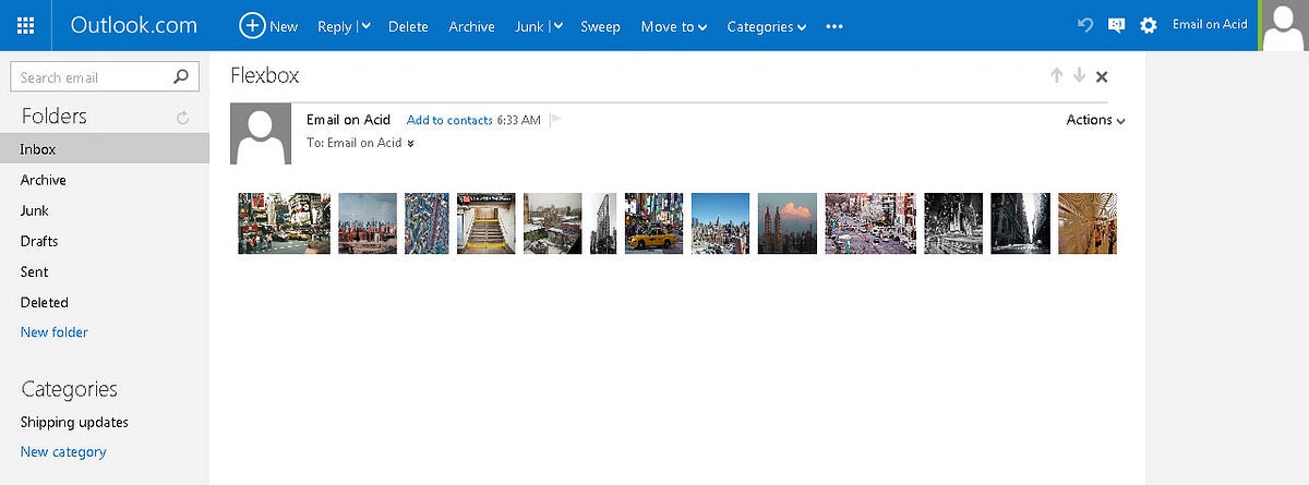
Gmail, Outlook.com and Office 365 also filter every properties related to Flexbox, except the property display:flex. And in my example, this causes a huge problem because the Flexbox layout is still applied, but with its default values. Thus, without flex-wrap, the wrapping of images no longer happens, and the layout is totally disastrous. Here’s an example of the render in Outlook.com in Firefox.
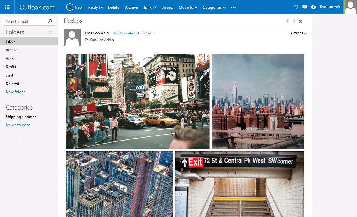
But Outlook.com has another specificity. It filters every properties related to Flexbox except those using the -ms- prefix. Flexbox will then work perfectly in Outlook.com, but only in Internet Explorer 10 or 11. Here’s an example of the render of the same email in Outlook.com in IE 11.
Note that this only applies for the old version of Outlook.com (still available in Europe). The new version of Outlook Web App and Office 365 still filters Flexbox properties, even with -ms- prefixes.
As for email applications, Flexbox works well in Apple Mail (on OS X or iOS), Android default email application (on Android 4.4 and below), Outlook app (on iOS and Android), and Thunderbird 31 (and above).
As a conclusion, I’d say that Flexbox in an email unfortunately causes more troubles than it helps solving. I think it can be interesting to use, but only for problems that can’t be solved otherwise. For example, the order property allows to reorder elements visually, not matter their order in the HTML code. Apple Mail on iOS 9 now support CSS @supports declarations. We can then write the following code :
@supports(order:1) {
    .parent {
        display:flex;
    }

    .child-to-reorder {
        order:1;
    }
}
This should allow us to make some progressive enhancements, while waiting for a better support…
This post was originally published on my blog in french and on the Litmus forums in June 2015. It was updated with information about support in the new Outlook Web App in January 2016.