Interactive Animation in HTML Email
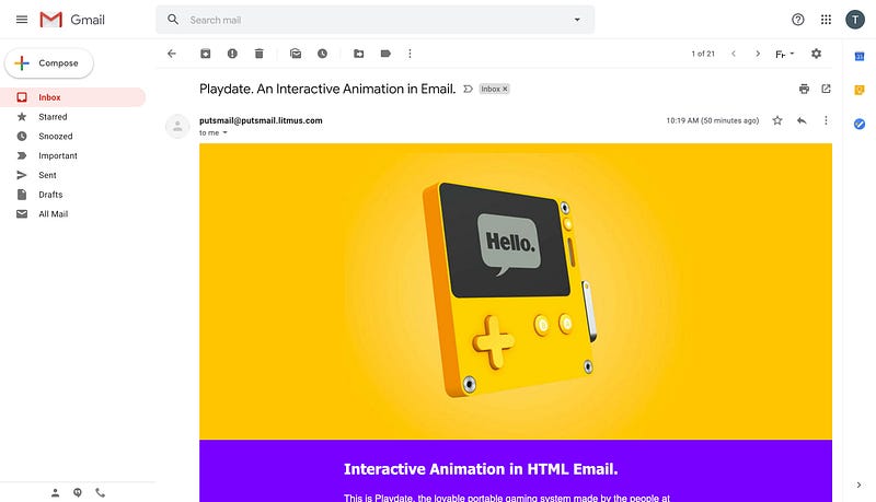
Last month, Panic announced Playdate, an adorable handeld gaming system with a black and white screen. And a crank. Yup. I’ve been a pretty big fan of Panic for a long time now, from Coda to Steven Frank’s How to Count to one of my favorite t-shirt ever to Firewatch. And their teaser page is really stunning, with an interactive 3D model of the console you can manipulate in your browser.
This inspired to make a little something based on an old experiment I did three years ago for a client. Without further ado, here’s an interactive animation experiment in an HTML email that works in Apple Mail, Gmail, Outlook.com, Yahoo! Mail and a bunch of other email clients.
Here’s how I did it.
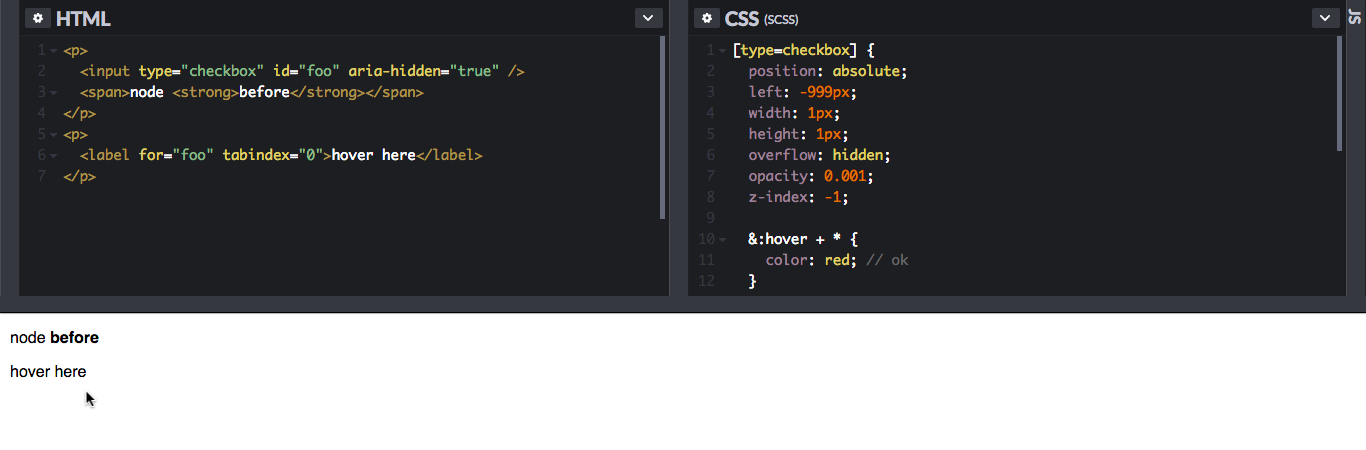
My first attempt with the label-to-input hack
It all started three years ago when I discovered a bit of an oddity in the CSS world thanks to a demo by fellow french developer Vincent Valentin.
In CSS, hovering a cursor over a <label> will also trigger :hover for its associated input. It’s pretty much written as such in the Selectors Level 4 specification:
[HTML5] defines a labeled control element as matching :hover when its label is hovered.
That may not sound like a big deal, but this is one of the rare case in CSS where one element can trigger styles on one of its previous element (parent or sibling) in HTML. Developer Roman Komarov has a great write-up on this in his Label-to-Input States article.
And so I went on to use this technique to try to recreate a 3D rotating model of a shoe we were using for a client on the web. The idea was to use multiple screenshots of the 3D model at multiple angles. Because Playdate’s website is nicely coded and readable, I was able to use the 3D model featured on their page. By simply using the gameViewer.setRotation(x, y) function they have on their scripts in my browser’s console, I made a loop to rotate the model at different intervals. Here’s the code I used. Try to paste it in your browser JavaScript console on Playdate’s website and see the model rotate (at the middle of the page).
var x = 0;
var xStep = 360 / 16 * -1;
setInterval(function() {
 x += xStep;
 gameViewer.setRotation(15, x);
}, 500);
My HTML code would then have a row of multiple labels next to each others. And then, using the aforementioned label-to-input hack, I’d change the background image of another element when hovering each label. Here’s what it would look like with just a few labels.
<input type="checkbox" id="checkbox1" class="checkbox" />
<input type="checkbox" id="checkbox2" class="checkbox" />
<input type="checkbox" id="checkbox3" class="checkbox" />
<div class="image">
 <label class="label" for="checkbox1"></label>
 <label class="label" for="checkbox2"></label>
 <label class="label" for="checkbox3"></label>
</div>
The basic styles to set up the image container and the labels row would look something like this.
.image {
 display: table;
 width: 640px;
 background-image: url(image0.jpg);
}

.label {
 display: table-cell;
 height: 320px;
}
And then here’s where the magic really happens. Using the adjacent selector ~ in CSS, we can target the image container following each checkbox being hovered. And thus we can apply different images.
#checkbox1:hover ~ .image {
 background-image: url(image1.jpg);
}
#checkbox2:hover ~ .image {
 background-image: url(image2.jpg);
}
#checkbox3:hover ~ .image {
 background-image: url(image3.jpg);
}
The result worked great in Apple Mail and even on the desktop webmail of Gmail. But it didn’t work in Outlook.com because the webmail doesn’t support the adjacent selector. And it didn’t work in Yahoo Mail because the webmail prefixes id attributes, but not for attributes, thus breaking the association between the label and input.
This made realize, however, that the :hover pseudo selector has great support on all those email clients. So I kept wondering if there was another way to make this work on more email clients. (Spoiler: there totally is.)
A solution with only :hover
Using only :hover to display different images meant I needed to find a way to display the triggering “labels” next to each others, all while maintaining the changing image at the exact same position. And the solution came from a mix of float ing elements and an article by Mark Robbins explaining how to fake position:absolute in emails.
Here’s an example of the HTML to represent of few frames of the animation.
<div class="frames">
 <div class="frame">
  <div class="toggler"></div>
  <div class="image image1"></div>
 </div>
 <div class="frame">
  <div class="toggler"></div>
  <div class="image image2"></div>
 </div>
 <div class="frame">
  <div class="toggler"></div>
  <div class="image image3"></div>
 </div>
 <div class="frame">
  <div class="toggler"></div>
  <div class="image image4"></div>
 </div>
</div>
The parent <div class="frames"> container is used to define the width of the animation. Each individual .frame container is also set to a max-height:0; to prevent a frame to block the following frames when interacting with the animation. This helps make the animation work when hovering either from left to right or right to left.
.frames {
 width:640px;
 margin:0 auto;
 overflow:hidden;
}
.frame {
 max-height:0;
}
Then each triggering toggler with a specific width and height. The width equals the total parent width divided by the number of frames of our animation. (So here, with just four frames, each toggler will be 25%.) And it’s also set as a float so that every toggler will sit next to each others, even though they’re in separate elements in the HTML.
.toggler {
 float:left;
 width:25%;
 height:320px;
}
Finally, .image containers are set with a width and height and a display:none; to hide them by default. Each .image container is set with a different background image, thus giving the illusion of animation. And a simple .frame:hover .image selector is then used to display the image when an individual frame toggler is hovered.
.image {
 width:640px;
 height:320px;
 display:none;
}
.image1 {
 background-image: url(image1.jpg);
}
.image2 {
 background-image: url(image2.jpg);
}
.image3 {
 background-image: url(image3.jpg);
}
.image4 {
 background-image: url(image4.jpg);
}
.frame:hover .image {
 display: block;
}
And voilà! Interactive Animation in HTML emails that work with just :hover. From my tests, this works really well in Apple Mail, the desktop webmails of Gmail, Outlook.com and Yahoo Mail but also on the french webmails of Orange and SFR.
One quirk I found is that Outlook.com only supports :hover on element selectors, but not on class or id selectors. So our last rule selector (.frame:hover .image) needs to be changed to the following:
.frames div:hover .image {
 display: block;
}
Making it responsive
I initially worked with a big sprite image to make images faster to download overall. But because of how background-position works in CSS (which is usually pretty handy), this wasn’t possible. So on top of using max-width instead of fixed width, the biggest trick to make this example responsive is to use a “magic ratio padding”. So in our previous example, we’ll use padding-bottom:50%; instead of height:320px;. In the final version of my email, my images have a weird 565x488 size. So in order to keep the image ratio, I’m using a padding-bottom:86.3716814% value (488*100/565=86.3716814).
Because this interactive technique is mostly based on :hover, we might want to disable it on devices where :hover isn’t well suited (typically smartphones). In my final version, I chose to use a @media (hover:none) media query to display a static fallback image. This works well in Apple Mail in iOS. In other email clients, we’d still be able to tap the screen on each individual toggler.
@media(hover:none) {
 .header div:hover .fallback { display: block; }
}
Here’s the final full version of the Playdate email I created on CodePen.
I hope this will inspire many of you to play with this technique and create fun and lovable interactive animations in emails. I’d love to see what you can come up with, so feel free to share your creations in the comments or hit me on Twitter.
Thanks for reading and have fun!
Updated on 18/06/2019 to clarify where the padding-bottom:86.3716814% comes from in the final example. And added a short paragraph to explain how I took the screenshots from Playdate’s website.