Remaking Lynn Fisher’s responsive illustration in an HTML email
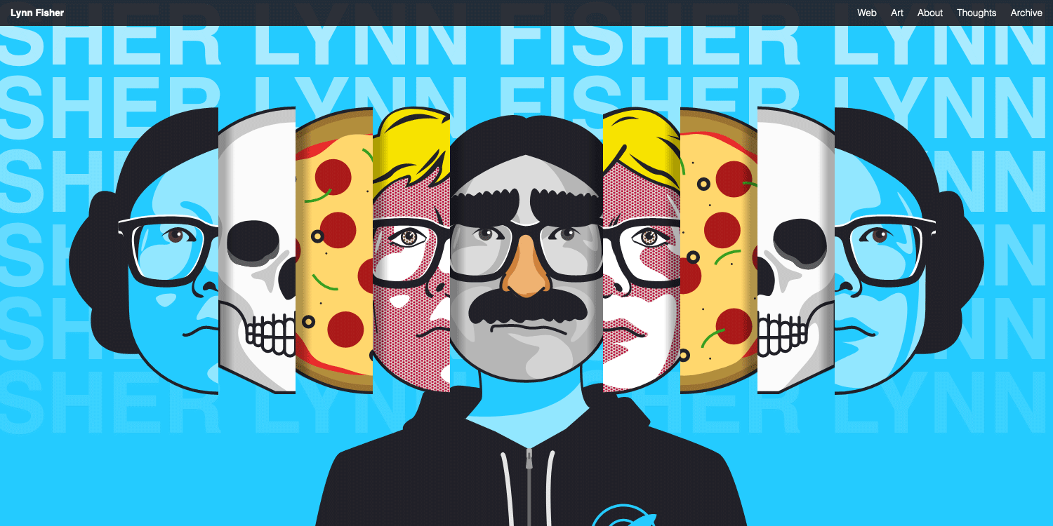
Lynn Fisher’s 2019 homepage responsive illustration has to be one of my favorite web design example of the past few years. It is a series a self portraits nested in each others, only showing when playing with the responsiveness of the page. I find it to be a perfect example of how design and code can work together to produce something original and meaningful.
Since I first saw this, I always wondered if this kind of responsive illustration could be done in an HTML email. Spoiler: it totally can. And here’s how I did it.
How the original version works
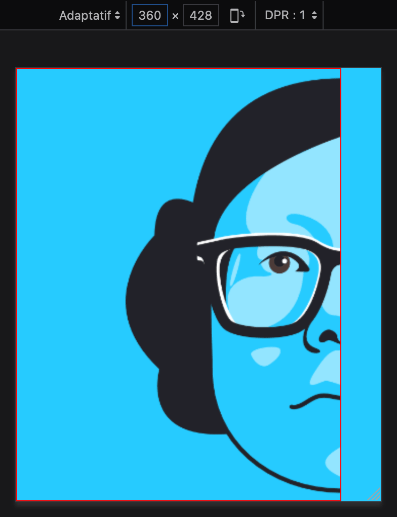
Lynn Fisher has written a great case study about this illustration and I really invite you to read it. Basically, every face in the illustration is split in two (left and right). And each part is absolutely positioned in the page, revealing new faces using media queries and dedicated breakpoints.
Here’s an example of HTML code for the first three faces.
<div class="face" id="blue">
    <img alt="" src="left-blue.svg" class="left" />
    <img alt="" src="right-blue.svg" class="right" />
</div>
<div class="face" id="skull">
    <img alt="" src="left-skull.svg" class="left" />
    <img alt="" src="right-skull.svg" class="right" />
</div>
<div class="face" id="pizza">
    <img alt="" src="left-pizza.svg" class="left" />
    <img alt="" src="right-pizza.svg" class="right" />
</div>
While this could work in one email client or another, media queries and absolute positioning are not really a good start to build an HTML email.
How the email version works
I went in a lot of different directions to see how this effect could be reproduced without absolute positioning. I tried using flexbox, using images with srcset and sizes to only show at specific breakpoints. I got closer using tables and background images, only to realize this didn’t work in WebKit.
The solution I ended up is, in retrospect, the simplest and the most elegant. It only relies on the properties max-width and background.
Let’s start with the left part of the top most face (the “blue” face).
<div style="max-width:321px; min-height:428px; background:#26cbff url('left-blue.png') no-repeat right top;">
</div>
Each face part is a 204×428px image, right aligned to its container. We set this first outer most face part a little extra width (at 321px) to give the whole thing extra horizontal margins on larger screens.
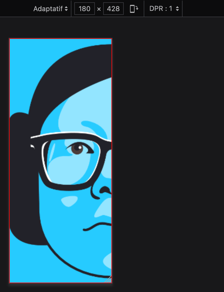
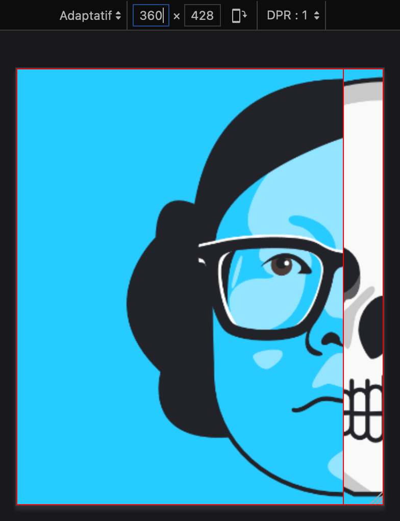
Then, we wrap this with the second visible face (the skull). The image is still right aligned. But we only want that face slice to show at a maximum of 107px. To do that, we set the max-width property to 107px plus the size of all the previous slices before. Thus, 107 plus 321 equals 428px.
<div style="max-width:428px; background:#26cbff url('left-skull.png') no-repeat right top;">
    <div style="max-width:321px; min-height:428px; background:#26cbff url('left-blue.png') no-repeat right top;">
    </div>
</div>
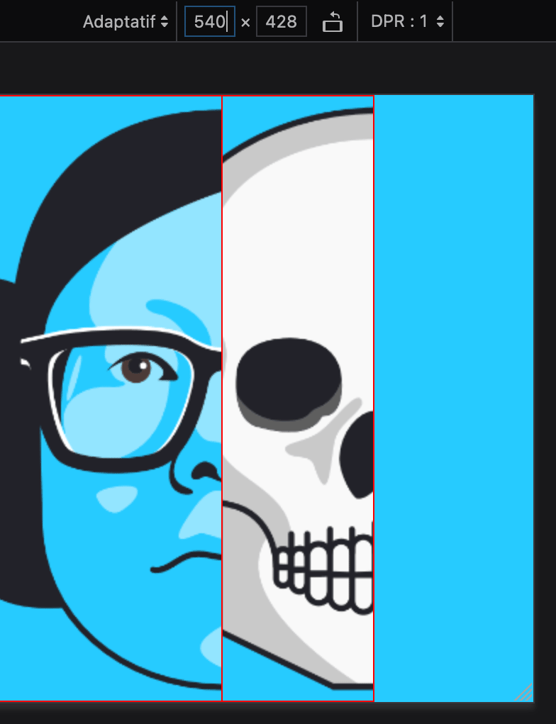
Then, we wrap this again with the third visible face (the pizza). Same deal as before: a right aligned image, and a max-width of now 535px (428 from the last slices plus 107 from this new one).
<div style="max-width:535px; background:#26cbff url('left-pizza.png') no-repeat right top;">
    <div style="max-width:428px; background:#26cbff url('left-skull.png') no-repeat right top;">
        <div style="max-width:321px; min-height:428px; background:#26cbff url('left-blue.png') no-repeat right top;">
        </div>
    </div>
</div>
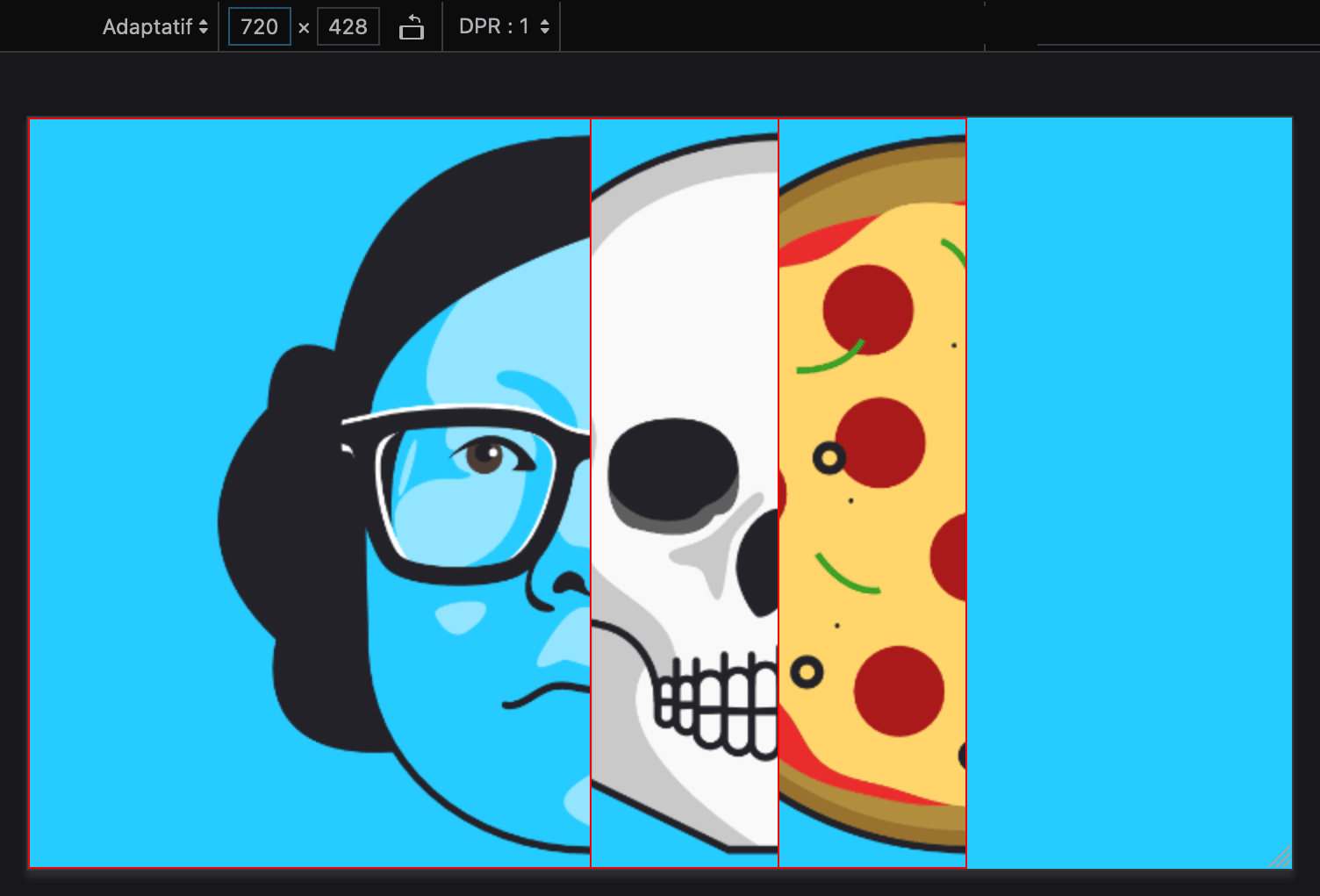
And so on for every new face. The last slice changes a little bit with a wider image and a repeating pattern. (But I won’t spoil it to you, so go check it out.)
And then we repeat the same structure for the right part of all the faces, except this time each image is aligned to the left of its container.
Here’s a minimal example with two faces (“blue” and “skull”) and the final center surprise.
<div style="background:#26cbff url('lynn-pattern.png') repeat-x center top;">
    <div style="font-size:0; text-align:center; background:url('lynn-armstrong.png') no-repeat center top;">
        <div style="display:inline-block; width:50%;">
            <div style="max-width:428px; background:#26cbff url('left-skull.png') no-repeat right top;">
                <div style="max-width:321px; min-height:428px; background:#26cbff url('left-blue.png') no-repeat right top;">
                </div>
            </div>
        </div>
        <div style="display:inline-block; width:50%;">
            <div style="margin:0 0 0 auto; max-width:428px; background:#26cbff url('right-skull.png') no-repeat left top;">
                <div style="margin:0 0 0 auto; max-width:321px; min-height:428px; background:#26cbff url('right-blue.png') no-repeat left top;">
                </div>
            </div>
        </div>
    </div>
</div>
Conclusion
Here’s the final version and a mirror on CodePen. Considering it only runs on max-width and background-image, support is really great. It works in Gmail (desktop webmail, mobile apps), Outlook.com, Yahoo! Mail (desktop webmail, mobile apps), etc.
It’s missing a few details from Lynn Fisher’s original work (like the subtle shades, the progressive scaling of each slice appearing, and, sorry about that… the dog).
It doesn’t work in The Outlooks. I started a VML version but didn’t get very far. I am wondering if it could work that way. Let me know if you get to anything.
I worked in this right after stumbling upon Lynn Fisher’s portfolio at the end of 2019. It took me a few months of back and forth and shower thoughts. I posted this on Twitter on June 17th, 2020 and got great feedback.
Then I started writing this post but procrastinated up until now. I hope you enjoyed it anyway!